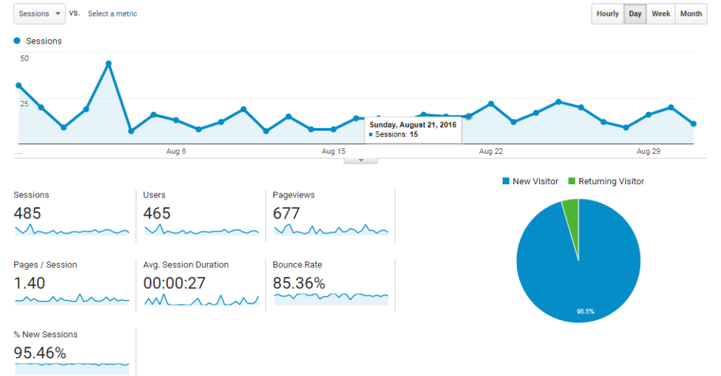
Bounce rate is a term that you have certainly come across if you have a website and use Google Analytics or another tool to measure site performance. But what does it mean?
By Google's definition, the bounce rate is a metric that shows the percentage of visits to only one page of your website (visits in which the user left the site from the same page through which he entered it). It is an indicator of the quality of the content on your site, related to the type of users you attract. A higher bounce rate can be an indicator that the content you are serving to your users is not relevant to their search.
Why is the bounce rate on my site high?
1. Look beyond the numbers
Let's face it, a high bounce rate doesn't have to be a bad thing. Much depends on the type of page you take users to through your advertising and what actions you allow them to perform there. If you are monitoring this metric for a landing page where the user can learn information about a product and you have not created links to other pages on the site, then you should not worry about its high levels. It is natural that after receiving what he was looking for and not seeing the next step, the user simply leaves the page.
The case is similar for those sites that contain only one page or the so-called. one-pagers. It is important to take into account other indicators - residence time, level to which the user scrolls, completed contact forms or clicks on the contact button on the phone, if you have such functionality.
What is actually a good bounce rate? It is considered that between 26% and 40% is the excellent level of bounce rate. From 41% to 55% you are at the average level, and up to 70% you fall below the average without any cause for concern. However, depending on the type of website (without a blog, news or event page), at a value above 70% you should think about what and how to optimize.
2. Data analysis
Do not consider the bounce rate as a concept for the whole site. On the contrary, dive into the metrics for each page, as well as for the different sources of traffic. This way you will find out from which channel and on which landing page users leave your site the fastest.
You may need to adjust the ads to be more relevant to the content on the site, or move the CTA button to make it more visible. Sometimes a very small change can have a big impact. Make a list of pages with unsatisfactory dropouts and focus on them. Edit by priority. Do the same with traffic sources.
3. Links to other pages
Do you guide your users from one product to another and from one article to another? If the answer is no, think again. When you enter a store, consultants usually come to you with questions about whether and how they can help and begin to show you products that are suitable for your search. Call-to-Action buttons and internal links are your virtual consultants.
In addition to improving SEO performance, they encourage the user to visit more pages. A page that offers various options for continuing the journey is significantly more likely to reduce its dropout rate.
4. Site loading speed
You've heard that countless times, haven't you? The speed of loading the site is important for search engine rankings, for the experience of your users and for… not to leave your site immediately.
According to a study by Google (SOASTA Research, 2017), while the loading time of a site increases from 1 to 5 seconds, the probability of the user leaving it increases by 90%.
One of the easiest and fastest ways to speed up the site and load it in the browser is to enable acceleration and caching technologies. Trust a reliable hosting provider that includes acceleration tools.
5. The mobile version
Open Google Analytics again. Select the menu Audience -> Mobile. Let's compare the dropout rate of different types of devices. It is more likely to be higher on mobile. This phenomenon is due to the fact that more and more users are surfing the Internet through their phones, as well as potential flaws in the mobile version of your site.
According to the Digital Experience Benchmark report of Contentsquare.com for 2021, the average bounce rate for mobile devices is 49%, compared to 42% for tablets and 45% for desktops.
It is extremely important that the mobile version is intuitive, easy to use, loads quickly and displays all the necessary content and functionality. In other words, mobile users expect to have as good, if not better, experience on their smartphones than on desktop computers.
However, let's take into account the fact that for some services and products that require more time, comparison, circumstantial reading of specifications, the preferred device remains a laptop or desktop computer. If you offer them, do not be upset by the high bounce rate. On the contrary, consider how to further improve the desktop.
The Digital Experience Benchmark report of Contentsquare.com for 2021 shows that the highest dropout rate is in the B2B sector - 75%, followed by telecoms - 56% and beauty products and services - 47%. It is lowest in the energy sector (38%), food shopping (40%) and travel (42%).

How do I reduce my bounce rate?
You probably already have some ideas for improvements from what you read above, and now we will pay attention to 5 more practical tips. Apply them now, don't leave today's work for tomorrow.
1. Change targeting and attract the right users
The reasons for the high bounce rate should not be sought only inside your website. You may not be targeting your ad properly or may not be using the correct channels. This way you reach users who are not really interested in the content or the products you offer. It is expected that when they come to your site, they are confused or indifferent and leave it quickly.
You should not neglect the power of advertising visions and the messages you use. Review them again and consider whether they are relevant to the content you then display on the site, and whether it is not time to update them.
At this stage, A / B tests would be extremely useful. In the world of digital advertising, you can easily implement them. If you advertise primarily on social media, try different target audiences. Create a set of vision and message and test its performance with colder broad audiences of interest and lists of people who have already made contact with your brand. In addition to the dropout rate, analyze other indicators that the platform gives you, such as impressions, clicks, conversions, etc. It's all a matter of research, analysis and testing.
It may also be necessary to completely change the channel or mix of channels. Experiment! Optimizations work like a chain reaction. When you create the right content and use the right channels to distribute it, you will naturally reach the right people. Which will automatically reduce the dropout rate.
2. Make the content easier to read.
A positive user experience begins with legible text and a well-formatted landing page. Poor formatting can be a brake and the user may not even get to the brilliantly written content. Long paragraphs and too small fonts are repulsive, so avoid them.
Format more clearly with these tricks:
- Use subheadings and lists to highlight the most important things when listing or to visually contrast two.
- Where appropriate, do not hesitate to insert graphics, images, diagrams with instructions on how to perform an action.
3. Create Call-To-Action buttons that really drive action
You have brought users to your site with a lot of effort and investment, do not miss them with buttons that do not work.
The CTA button must be clear and direct. Its job is to make the user want to know what's on the other side after that click.
When optimizing these buttons, every detail is important. Sometimes changing one word can show a huge difference in perception. If you've used "See more" but the button leads to a product, replace it with "Buy Now" or "Order" for example. When offering a free trial period of a service, it's a good idea to indicate that it's free with phrases like "Test for free" or "Run a test period."
4. Tell a true story
Storytelling brings the brand to life and translates its values and messages into an understandable language close to consumers.
However, we are not talking about the About Us or Company History pages, which are mandatory for almost every business site. We don't talk so much about the style of writing. Imagine it differently - every page you take your users to tells a story. Whether it's the story you're developing in a blog post or the story related to your product depends on what you're aiming for.
In order to place the key moments of it in the right places and to be easily and quickly perceived, analyze how your users browse the pages of your site. Do they scan them (as most online surfers do) or do they read thoroughly and carefully? A useful tool for this task is Hotjar.
Arrange the important elements - eye-catching words, CTA buttons, infographics or an eye-catching picture, in exactly those parts of the page where visitors keep their eyes peeled.
You can test different designs and configurations and in time you will decide which one works best. However, always try to look authentic.
In a highly competitive digital environment, consumers stay longer and perform the actions they aim for only on the websites of those businesses they trust. Put yourself in the shoes of your customers. Be just as honest with them as you would like them to be with you if you are the customer.
5. Open the links in a separate tab
One last tip, which at first glance is implied, but at second we find that many owners of company websites and stores fail to do so.
By loading the links in the same tab, you force visitors to press "back" constantly to return to the main page. This is tiring and disrupts the positive user experience. The other scenario is even more negative for you - the user does not come back at all, distracted by the new page you show him.
So be sure to check "Open in new tab" in the hyperlink setup.
Conclusion
Look at the bounce rate more globally from the outside in. Realize what kind of audience and through which channels you attract and whether it is the right one. Then delve deeper into your website page by page - optimizing their content, appearance and loading speed. Apply at least one of the tips above and measure the results.
Share with us in the comments your progress or ideas that came to your mind in the process of work.
If you need assistance with issues related to the hosting of your site and its maintenance, do not hesitate to reach out to Stablepoint. We are online 24/7.

Nadejda Milanova
An experienced Content creator in the field of Search Engine Optimization (SEO) and WordPress. A true proffesional with a Master's degree focused on journalism.
Read more by Nadejda Milanova


