


With the development of technology and the widespread use of mobile devices in everyday life, mobile traffic to websites is dramatically increasing in size. Following this trend, from July 2019, Google imposed the Mobile First Index rule on all new sites. In this approach, search engine bots first check their mobile version
Why is this an important change that would affect your projects?
In the process of indexing, the mobile GoogleBot visits the page and analyzes its textual content, as well as its overall visual layout. The position of the site in the ranking is determined according to Google's algorithms and indexed information. That's why it's a good idea to make sure your site is optimized for mobile devices.
If it does not meet Google's basic criteria for a mobile-friendly vision, you need to take action to optimize it as quickly as possible.
In case you are starting a new project now, it is important that the focus in the development of the site is focused on users using mobile devices.
How to check if our site is mobile-friendly?
If your site looks equally good, regardless of the screen size of the device used by the user, then it uses a responsive design. The CSS code tells the browser how to arrange the content of the page according to the screen resolution. This improves the user experience when using mobile devices. In this case, you will not need to take action or change the structure of the site.
If you have a separate mobile version of the site, make sure the information is identical to the desktop version. The site needs to use equivalent structured data for both versions. Structured data provides information about your page and the type of content that is added to it. In this way, it will be better presented to users when searching.
You can check if the site has structured data using the Rich Results Test tool.
Important: You can directly verify that your site is mobile-friendly and complies with Google's recommendations using the Mobile-Friendly Test tool.
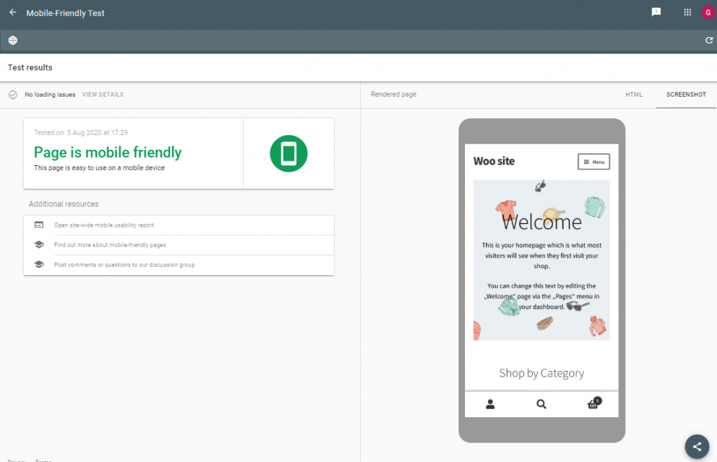
Mobile-Friendly Page Test
In case your site does not meet the requirements, a warning message will be generated and you will receive recommendations on what you need to improve.
Regardless of the test result, you can review Google's top recommendations for improving the mobile user experience. This will help you track whether they are implemented for your site.
How to make WordPress mobile-friendly?
WordPress is one of the most widely used systems for building sites with a variety of topics. Whether your site made with this system will be mobile-friendly depends on the theme and plugins you have chosen to build it with.
Using a Responsive Theme
When creating a site with WordPress, the first and most important step is choosing a theme. Make sure the theme you choose is mobile-friendly and uses responsive design.
You can track how your site will load on a mobile device with the selected theme after it is installed in WordPress through the admin panel "Appearance" »" Setup ". In the lower right corner of the menu you will find options for visualizing your site on desktop, tablet and mobile device.
Are you using a theme that is not mobile-friendly?
If your site is already built with a theme that is not optimized for mobile devices, you have the following options:
Make sure your theme is updated to the latest version. The use of responsive design is among the main criteria when building a website. It is possible that the developers of the theme have optimized its code in future versions. If the theme you use is paid for or developed specifically for your site, you can contact its developers for assistance.
Use additional plugins to switch to the mobile version of the site. There are various plugins in the official WordPress plugins directory that will help you improve the look of your mobile site or completely modify it.
Completely change the look of the site by choosing a new theme that has a responsive design.
It is important that this type of change be made to a test installation, as settings and features specific to your current theme will not be available after you change it.
Additional plugins
If your chosen option is to install additional plugin to optimize your site and move to a mobile-friendly version, we will now introduce you to the most popular plugins:
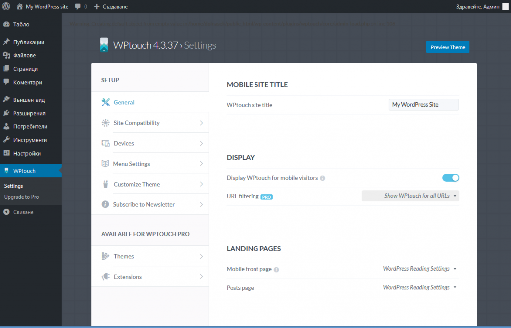
WP Touch
WP Touch is one of the most used plugins for modifying themes that do not offer responsive design. After its installation, your site automatically receives a mobile-friendly vision.
You can use the free or paid version, and one of the advantages of WP Touch Pro (premium version) is the ability to use the plugin in combination with caching mechanisms.
The plugin creates a separate WP Touch menu in WordPress administration, through which you can easily manage its settings.
WP Touch Settings
If you want to modify the visual settings of the site, you can do so through the menu "Appearance".
An important step in the setup is the selection of a menu to be displayed to users using mobile devices. In order to be able to use the currently set menu for the desktop version of the site and for mobile devices, you must check it through "Appearance" »" Menus "» "Menu settings" »" WPtouch: Header Menu ".
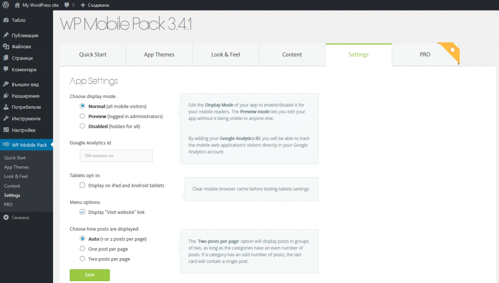
WordPress Mobile Pack
WordPress Mobile Pack is a plugin that allows you to convert content on your site into a progressive web application (PWA). PWA is a mobile site built with JavaScript framework, which has some of the functionality of a mobile application.
When you install it, a default theme is set, which will be used to preview your site for users using mobile devices.
The plugin provides a free and paid version, and in the paid version you have the opportunity to choose between different themes to be used by the mobile version of the site, as well as other add-ons.
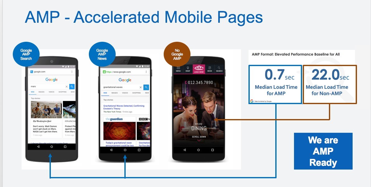
Accelerated Mobile Pages (AMP)
To improve the user experience when using mobile devices, you can add Accelerated Mobile Pages (AMP) support to the site. AMP is an open source project launched in 2015. Its goal is to improve the speed of sites when using mobile devices.
In WordPress, you can integrate this support by installing an additional plugin such as AMP for WordPress.
After installing the plugin, the HTML code of your site will be converted to use AMP support. You can choose from several levels of operation of this plugin, depending on the extent to which you want the site to be modified.
Google continues to work to improve the user experience of mobile sites. The introduction of AMP-based Web Stories is one of Google's promising projects.

Nadejda Milanova
An experienced Content creator in the field of Search Engine Optimization (SEO) and WordPress. A true proffesional with a Master's degree focused on journalism.
Read more by Nadejda Milanova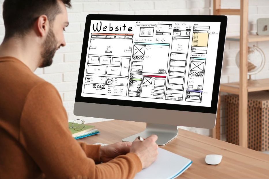
