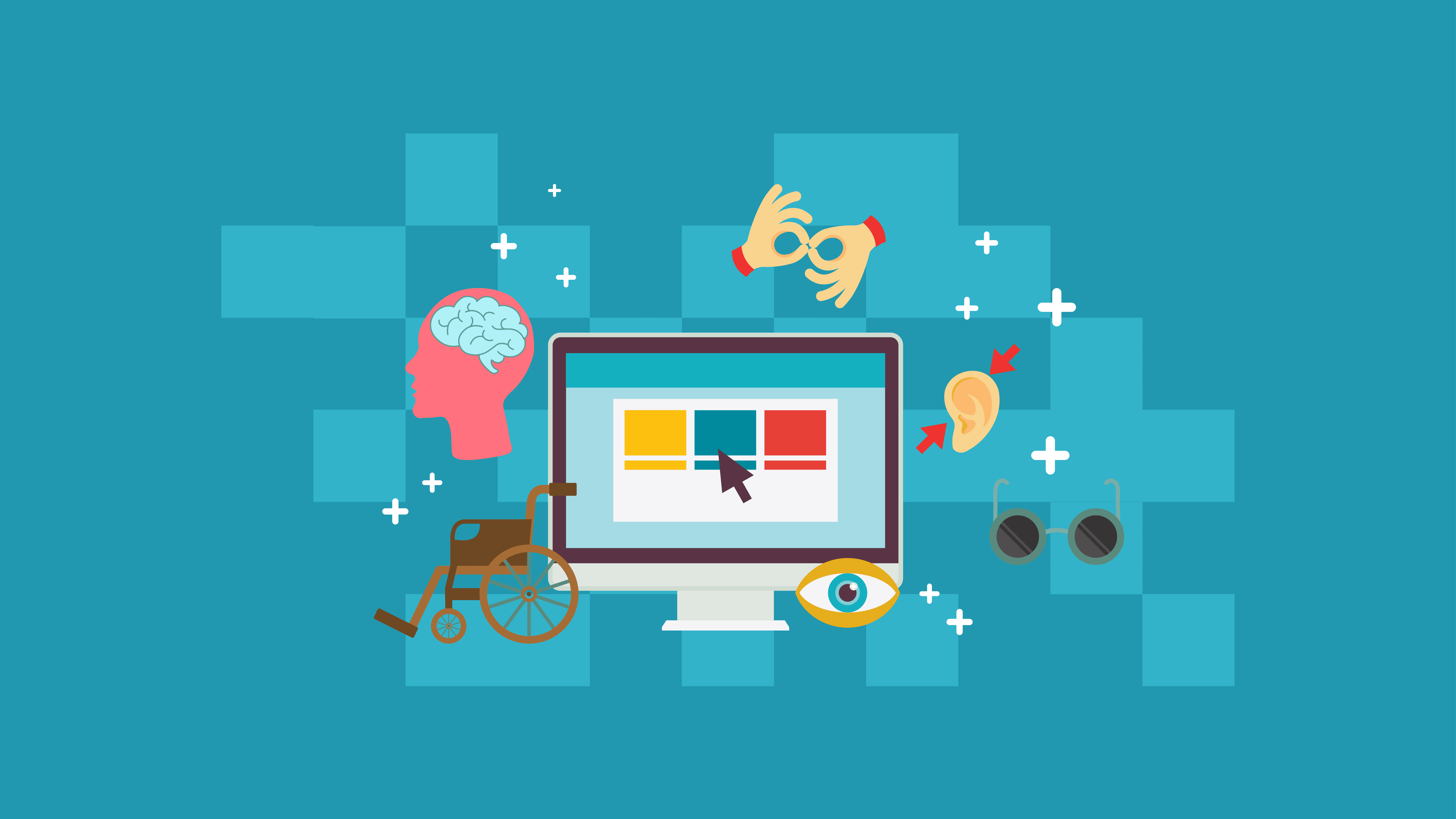
98% of websites have at least one major accessibility problem on their homepages, such as low-contrast text, missing images with alt text, and blank links.
It’s important to ensure that your site is accessible to all of your visitors. Some people may experience barriers such as visual or hearing impairment, for example. These barriers can make it difficult or impossible for visitors to use your site.
Web accessibility is the practice of designing and implementing digital products to be as usable as possible for as many people as possible, including those who might not be able to use a mouse or keyboard. Once you’ve assessed the state of your site, here are some web accessibility tips to help you design a more inclusive site.
Your theme needs to be accessibility-ready
You can choose from a variety of themes for your site, but not all of them are accessible to disabled people. In fact, some themes have features that can make it more difficult for visitors using screen readers to access your content.
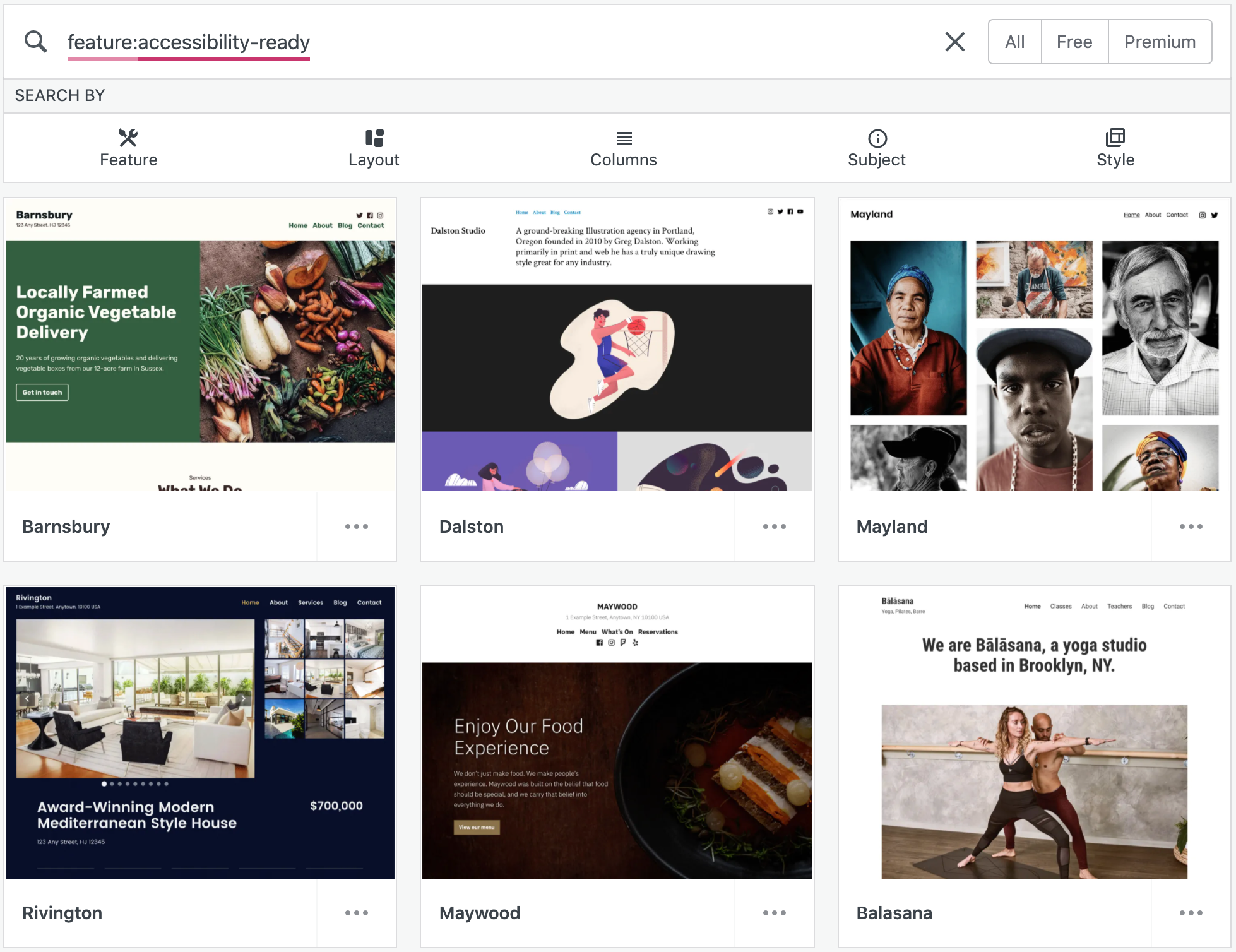
We all know how important accessibility is. Luckily, there are free themes available for you to choose from. When choosing a theme, keep in mind that you’ll want one that is accessible. Balasana is a minimal theme that’s perfect for graphic designers or photographers, while Mayland is ideal for those who are telling stories with their businesses. Testing has found that these two themes are very accessible and usef-friendly.
Display title and tagline
If your theme doesn’t support alternative text, you will need to upload a custom header image for your website. A header image is a visual way to brand your site or display the title of your blog. You can also use it as a way to promote the name of your business, if you're offering an online product or service.
If you want to include your site title and tagline on your header, fill them out in the main settings tab. From there, go to customizing, and under Site Identity, check Display Site Title and Tagline. You can find this option in Design → Customize.
Use appropriate headings for pages and posts
To make your content more engaging and easier to follow, use the Heading Block. Add a heading to a page or a post by clicking the “i” icon in the top toolbar of the block editor. Also, make sure you review any errors or incorrect headings before publishing.
Select colours and fonts for legibility
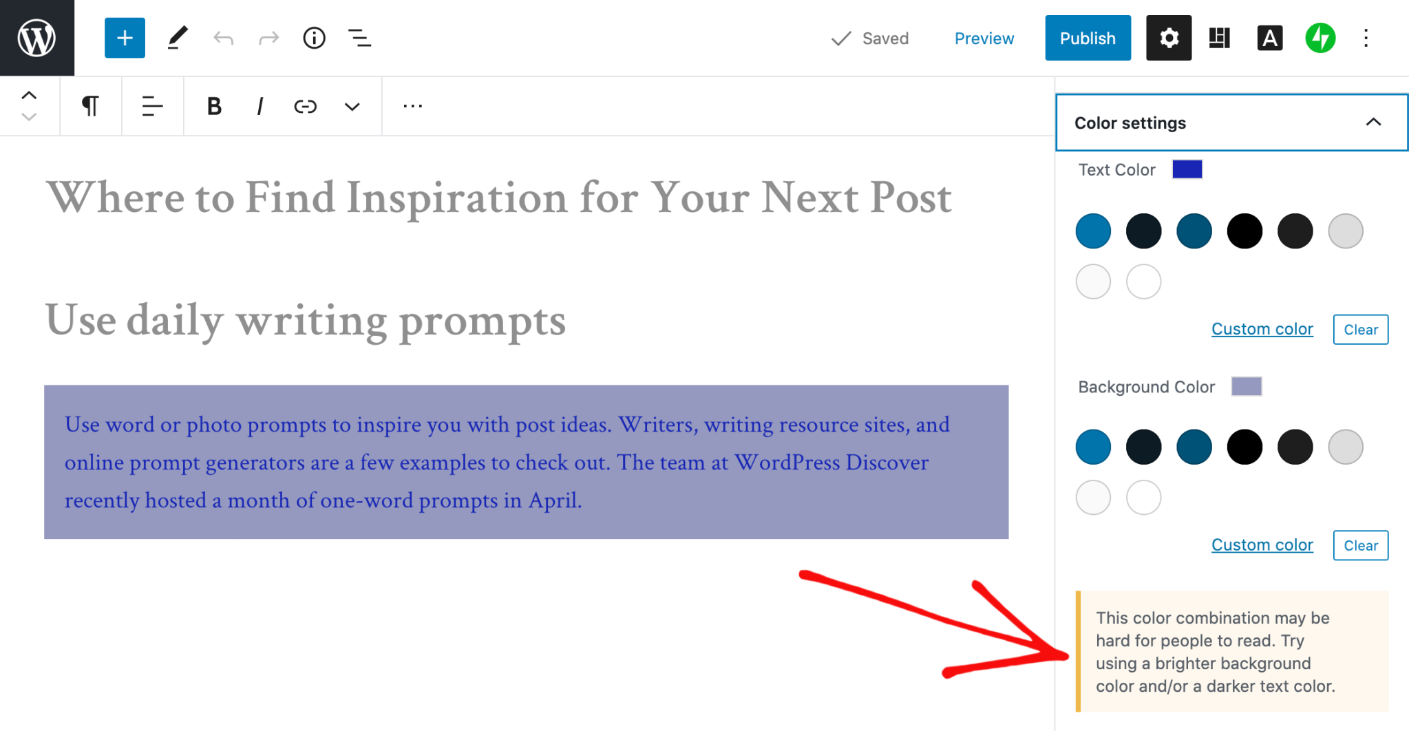
A site with an easily readable font is essential for your brand. Straying away from difficult-to-read fonts, inconsistent colour palettes, and light text are musts for standing out on the internet. Attention to contrast is also important.
The block editor will warn you if it detects poor color contrast in the specific block you’re working on.
Clear description of links
When linking to another page or post on the web, use descriptive text. Rather than “click here”, try “learn how to apply to my writing workshop.”
Add captions to images
Every Image Block should have a description of the image underneath it. If you want to be even more helpful, the caption can include the photographer's name and information about the rights they have so readers know who took the photo and how it can be used.
Add alt text to your images
Pictures are great, but they can also be a hassle for people with disabilities or slow internet connections. An element that is often overlooked, however, is the alt text that accompanies photos. Alt text provides context to people who cannot see what you’re trying to show them. It is also important for your site’s SEO! You might think you have written an amazing article, but are your images tags conveying the same message?
After adding an Image Block, be sure to add the alt text in the box below in the Image Block settings.
Create clickable CTA areas
With the Buttons Block, you can add a call-to-action button to your page or blog post quickly. If you design and embed your own buttons with Image Widgets, make sure they're large and easy to click.
This is a good tip for text links too. For example, you can tap on a hashtag or asterisk in a sentence to open up an embedded link, but not everyone can read it.
Use captions or transcripts for multimedia content
You’ve got video content on your site. How can you make it accessible? It’s important to add subtitles or to transcribe the speech, sounds, and actions seen in the video. Podcast transcripts are also helpful. And if your videos are autoplay, make sure there are options to pause, adjust the volume or to turn off sound altogether.
Learn and improve
To learn more about accessibility best practices, explore the resources on the W3C Web Accessibility Initiative (WAI) website. You can also get involved in improving WordPress’s accessibility.

Nadejda Milanova
An experienced Content creator in the field of Search Engine Optimization (SEO) and WordPress. A true proffesional with a Master's degree focused on journalism.
Read more by Nadejda Milanova

