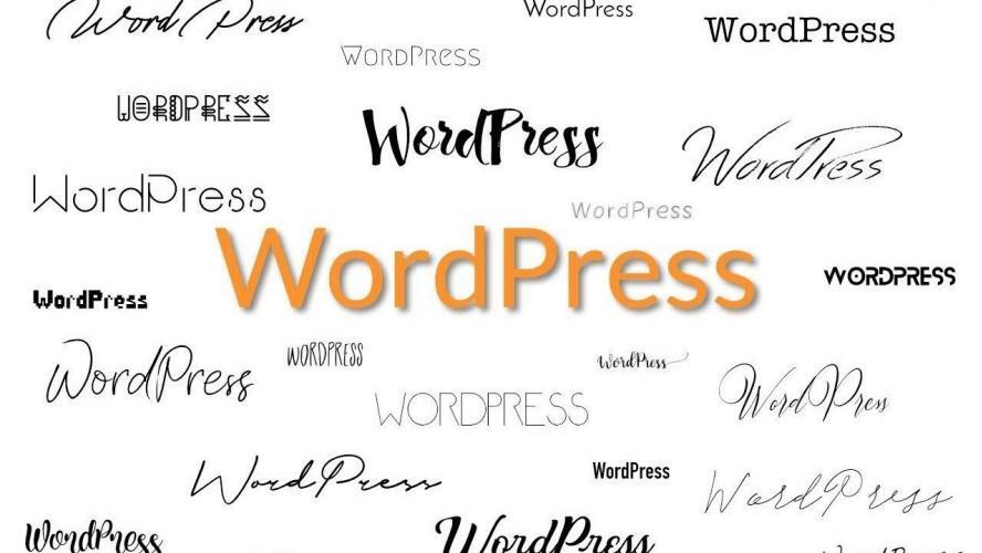
Fonts are a small but very important element in creating a website. Often established brands around the world use only one specific font, which is part of the company's brand identity. This in itself shows how important it is.
Be careful with the choice of font, because your WordPress site must first be readable and not irritate the eyes of your users. In today's article we will look not only at why the role of fonts is important, but also what types there are, and how to change them. Let's start:
What is Typography?
Typography is the science behind the creation of fonts. Very often the reason why websites do not look professional is the poor selection of fonts. Consumers are used to using several in number, but it takes design flair for their combination to be successful.
We advise you to use well-known fonts and not to combine more than 2, at most three different and not similar to each other. The goal is to get a nice contrast. Serif letters are the easiest to perceive and look very stylish, thanks to their rounded edges. The size of the letters you want to bet on is 12-14 px. Large enough, easy to read, and at the same time delicate to the human eye.
Types of Fonts
Web safe fonts - fonts that are installed on your computer or operating system. Examples are the well-known Times New Roman, Arial, Calibri, and others. Very often some of them are a combination of fonts, in case your operating system does not recognize one font, it is assumed that it will recognize the other, in combination with it.
Web fonts - instead of copying additional files to your own site, you connect to the font provider's website and they are downloaded from there, ie downloaded to your site. This automatically means that you will have access to the latest versions of fonts without the updates taking up space on your server. Examples of this are Google's Open Sans and Roboto fonts.
Locally hosted fonts - They are convenient because you have control over the fonts and you will not depend on a third party and their serviceability, which it offers. They download directly and faster on your site. You also have full control over the caching of fonts in case of any problems.
The most used fonts
Script
Extremely artistic version. It is interesting because the letters are curved and look like handwriting. They are divided into formal and casual. The official ones are masterful handwriting from the 17th or 18th century. This everyday font is very easy to distinguish and one idea more readable. This is the reason why it is preferred between the two.
An example of a font that we are sure you will immediately remember is the Instagram logo. Extremely pleasing to the eye and easy to read. Over the years, the colors they use also change. They are also an extremely important element for an established brand.
Display
Suitable for people who are more eccentric. These fonts grab our attention instantly. They are considered ancient and have an association with the 19th century. We advise you to use them when you want to emphasize a loud headline or news as an accent because in whole text with paragraphs will not stand out well and you can achieve the effect of poor readability. An example of this interesting font is the Disney logo. And who doesn’t love Disney?
Serif
Serif fonts are one of the best choices you can make. The letters contain a small end line at the end of the letter. Subconsciously marking the end of the elements of the letter makes it easier and faster to perceive the sign.
It is no coincidence that they are the basis of all leading copywriting tips for creating attractive presentations, titles and materials by professionals in the field.
The reason is that they are extremely ethereal and easy to perceive by the human eye. We are used to them, they carry the association of a familiar font that can be read easily. The most recognizable font for you is probably Times New Roman. An example of a brand that relies on serif font is Volvo.
Sans Serif
It is one of the most recognizable fonts on the Internet. It is clean and very modern. Great option for writing long texts, unlike some fonts, which are mainly recommended for use in accents in the title due to poor readability. Sans Serif is one of the top choices for WordPress sites. A recognizable brand that has trusted the impact of San Serif on consumers is Calvin Klein.
Modern
The font name speaks for itself. This option is for people with a flair and flair for the modern and different. We believe that you will easily recognize all fonts that fall into this category. Often these are brands from the world of fashion and show business. Sometimes the association they evoke is eccentricity and coldness. They differ in that the letters are of different thickness and height in each letter, which screams for a distinctive style of expression.
When you want to use such a font for writing long text, choose a font that will be more pleasing to the human eye, in which the letters do not differ so much in contrast. We are sure that among the sea of choice, you will find the best for you and your taste. An example of a brand betting on Modern is Vogue magazine.
How to install new fonts and make changes?
In recent years, Google Fonts has been one of the most widely used fonts because it is diverse and accessible directly from the Google directory. It is extremely easy to integrate them on your WordPress site and we will now show you two ways to do it.
Please note that fonts that look good in the title are not always suitable for the use of large texts and vice versa. If you want to find two different texts that complement each other, you can also find ready-made suggestions.
When you're sure you've chosen the right font for your site, it's time to move on to the real deal. Let's start with the first option:
Adding fonts thought plugins
Log in to the administration of your WordPress site, then click on the "Plugins" button and then on the "Add new" button. You will see a search box at the top right, where you need to type "easy google fonts" and specify a search. The plugin will appear in the first position and to install it click on the "Install now" button. Then in place of this button, you will see the button "Activate", which you must also click.
Once you have activated it, you need to add it manually to your site. To do this, go to "Appearance" and then to "Customize". A field will appear for your topic, on which you should click on "Typography", then on "Default typography".
The typical font setting elements will appear on the screen - paragraphs, heading 1, heading 2, etc. The paragraph is the main part, the body of your text. It would be good that the titles (including subheadings) be in 2 different fonts. Do not mix more than 2.
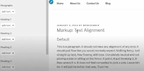
In our case we will bet on the font "Lora" and we will keep the size of the letters in the original version. Consider other options. You can also change your "Heading font" in the same way.
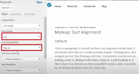
Once you have made the perfect choice for the fonts on your site, you need to click on the "Publish" button to save the changes and activate them on your site.
Manually add fonts
Step 1:
Go to fonts.google.com. You can choose to search by category, language, or font properties. If you liked a particular font, you can search for it at the top right with the "search" button.
In our case, we chose a specific font named "Lora". Once you type the name in the Search box, only the specific font appears. Click on the name, in this case, "Lora" and then give the button "Select this font".
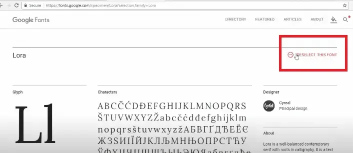
Additional fonts will appear on the left side of your screen, which is appropriate in combination with your first choice. In our case, it's Open Sans. If you want to add them both. it is necessary to click on the first button in the form of plus +.
Then at the bottom right, you will see a small field that says: "2 Families selected". Click on it and an additional field will open. Copy the text from the "Standard" field.
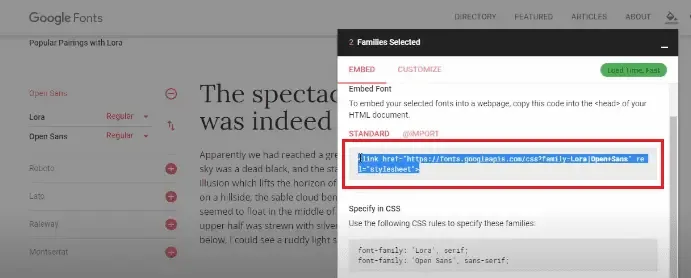
After copying the box, go to the control panel of your WordPress site. Go to the "Plugins" section and then "Add new". To make it easier to upload to the search engine, type "Insert headers and footers" on WordPress Beginners and install. It takes a few seconds.
After activating it, go to the "Settings" section, then to "Insert Headers and Footers" and in the top field of your screen, you should copy the link we took above the "Families selected" button when selecting fonts.
Let us remind you that this is done by going to fonts.google.com, selecting a specific font from the "search" field. Click on the + button on the specific font, then "Select this font". You will see additional fonts that match well with your chosen one and click the + button again. At the bottom right you will see the field "2 Families Select". There you will also find the link we talked about a while ago. Put it in the following field and press the "save" button:
All you have to do is go to the "Appearance" section, then click on "Customize", then on "Additional CSS Settings" and put the same link in the field.
It is very important to regularly maintain your site and update its plugins. Follow the trends and always be up to date. This way your site will be in its best shape and will be different from all other non-professional and unsupported web pages on the web.
We hope you found this helpful in choosing a font and installing it directly on your site. Remember that your site is your business card to the world. Try to refine it to the smallest detail. It is a collection of many elements, one of which is the fonts. Choose the most beautiful and practical font for your web page.

Nadejda Milanova
An experienced Content creator in the field of Search Engine Optimization (SEO) and WordPress. A true proffesional with a Master's degree focused on journalism.
Read more by Nadejda Milanova

