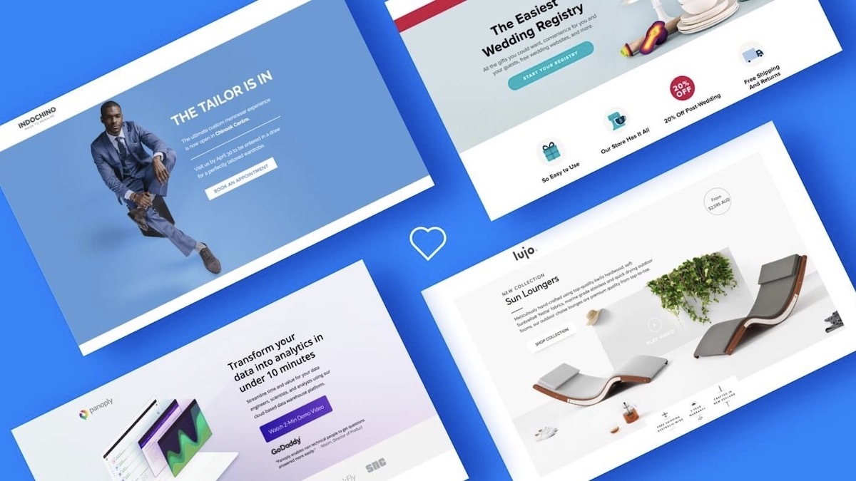
Whether launching a new business, taking your brand online, or looking to level up your digital marketing strategy, landing pages are one of the most important weapons in your arsenal.
Even if you’re an inexperienced digital entrepreneur, you’ve almost certainly heard a little about landing pages. Before getting started with landing pages for your professional web hosting strategy, though, this simple guide will answer all of your key questions, including but not limited to;
- What are landing pages?
- Do I need landing pages?
- How can I convert landing pages for sales?
- What should my landing pages look like?
- Who should my landing pages be aimed at?
By the end of this post, you’ll have a far greater understanding of landing pages and their potential. Let’s get started.
Quick intro
What are landing pages?
The Cambridge Dictionary defines landing pages as “the first page that you come to when you go to a website, especially after using a link in an advertisement”.
When you direct a consumer or lead to your website, they will ‘land’ on the page that is connected to the URL of the photo or text that they have clicked. In their simplest term, landing pages are the specific web pages that you have directed customers to.
Your content could potentially direct users to your home page, product pages, services pages, or about page. While all web pages technically fit the standard definition, most marketers agree that landing pages can be better defined as standalone pages designed specifically as a marketing tool to support the digital ad campaign.
In short, then, you will design landing pages that are separate from the home page and other main features of your website. And customers will only find it by clicking the link connected to your advertisement. What is the aim of your landing page?
Landing pages are an ideal addition to your digital marketing strategies because they allow you to tailor the user’s first interaction with your website according to the advert that has piqued their interest.
The purpose of your website homepage, for example, will be far broader. However, when a user clicks an ad for a specific product, taking them to a landing page that is specifically connected to that product prevents any confusion or the threat of getting lost during navigation.
Given that consumers start to form opinions of the website after just 0.05 seconds, landing pages go a long way to setting the right atmosphere. Landing pages can deliver clear information about the product or service while simultaneously building upon the details that may have been included in any ad linking to the webpage.
Calls To Action
While traditional web pages set out to achieve a variety of goals, landing pages are focused on getting the user to complete a specific action. This is known as a Call-to-Action (CTA), and they are ultimately the main aim of any landing page.
A Call-To-Action is an instruction that is designed to put a prospective lead on the path to conversion. Some common examples of CTAs found on website landing pages include;
- Navigation to a product purchase page or order form. Instructions may include terms like “Buy Now” or “Preorder Yours Here”.
- Encouragement for consumers to provide their contact details to let the brand arrange a follow-up email or call. CTAs may be “Sign Up Here” or “Request A Callback”.
- Promoting a newsletter or similar item so that the company can maintain direct promotions. “Join The Newsletter” or “Find Out More” are some examples.
- Try for free Call-to-Actions that give users a chance to try a product or service before hopefully converting. For example, the CTA could state “Start Your Free 1 Month Trial”.
- Donation CTAs for non-profit organizations. Examples may include instructions like “Donate Now” or “Help Today”.
Landing pages may also use CTAs that offer users free content, ranging from samples to downloadable eBooks, in return for their contact details. Ultimately, they should relate to the content included specifically on the landing page and encourage engagement based on the data insights you have from the intended audience.
In short, the aim of the landing page is to make a consumer complete the CTA. If they achieve this goal, they are doing their job.

Do I need landing pages?
Understanding what landing pages are, along with their function, is one thing, however, most business owners will ask “do I need landing pages?” as they do not want to invest time and money into a concept that won’t deliver positive results.
When it comes to landing pages and their value to your business and its digital marketing strategies, the stats could not be clearer:
- Landing pages that are targeted and tested can boost conversions by 300%.
- One-quarter of landing pages deliver conversion rates in excess of 5%.
- Over 90% of visitors who read your headline also read the CTA.
- A single CTA can increase clicks by 371% and sales by 1617%.
- Companies with 40+ landing pages gain 12x more sales than those with 15.
Landing pages are a great tool for continuing the advert, giving the user far more detail that can be expressed in a social media post or a PPC ad.
Despite the fact that most marketers believe that landing pages are one of the most important tools for speeding up conversions and capturing client data before they can abandon the company’s site, very few businesses use them well. In fact, only 22% of companies are satisfied with their efforts while the majority of those that are could be doing much better too.
If you’ve been asking “do I need landing pages?”, the answer is an emphatic yes. More than that, though, you must be sure to use them well.
What should a great landing page look like?
By now, the value of landing pages should be fairly clear and you will be eager to either start using them or increase the number used. The next step, however, is to ensure that the design and content meet the desired standards.
There are several features to consider. Firstly, the colour schemes should match your brand to establish a sense of familiarity. Following this, you should focus on these features:
Headline
The headline or landing page title should be a short, sharp sentence that echoes the statement expressed in the main advert that was clicked. It should also aim to build an increased level of excitement that makes the user want to read on.
Many landing pages will include a short paragraph of supporting copy underneath. This leads on from the headline while simultaneously ensuring that the targeted keywords are present high up the page for both SEO and user-friendly purposes.
Call to Action
The call-to-action is probably the most important piece of information on the entire landing page. As such, you will probably want to include it quite close to the top of the webpage. In most cases, the CTA will be repeated at several points.
While the wording of the CTA may change, it’s important to stick with one instruction, such as navigating to the product page. The CTA may also be supported by a data capture field. In this case, using around four fields is best.
Video
Statistics show that relevant video content can boost landing page conversions by 86%. Video allows you to express a lot more information than text copy while it also breaks down language barriers. The user will remember a far greater amount of content too.
Video content also encourages users to visualize themselves with the products and gain a deeper understanding of the USPs. Audio content is another option, but videos are the most effective solution by far.
Copy
Text copy will usually be promotionally driven. You may also find that bitesize chunks and easily digested content works better than overly long paragraphs. All aspects of completing any purchase should be enjoyable. Try to keep yourself in the consumer’s shoes.
There is such a thing as too much content. However, it is shown that long-form landing pages do generate 220% more leads. The key is to maintain engagement throughout. Presenting the content as a series of landing pages is ill-advised.
Social proof
Trust is a key ingredient in the recipe for success, and social proof is one of the best ways to gain it. Your landing pages should include at least one example to show consumers that they can buy with confidence.
Social proof may mean adding testimonials, not least because over 92% of consumers read them. Alternatively, photo evidence of past projects or statistical analysis to showcase your USPs can be very useful too. More trust means more conversions.
Design
All of the above features are crucial. Still, you must ensure that they do not negatively impact the general impact of the landing page. It should load fast and responsive on all screens, especially mobile. It is now the dominant way to access content.
Compressing images and avoiding elements that will slow the page or cannot be loaded on mobile is key. A solid web design expert or site builder will enable you to target both desktop and mobile audiences in style.
Finally, you must avoid overcomplicating the navigation or encouraging users to look elsewhere on your site until they’ve completed the intended action. Because once they leave the landing page, they’ll quickly forget whatever message it was trying to achieve.
A word of warning about landing pages
When designing your landing pages, it is imperative to familiarise yourself with the potential dangers too. While they are a powerful tool that can influence a consumer’s mindset and behavioral habits, inadequate landing pages may lead to several problems.
Firstly, if you are thinking of copy and pasting landing pages on your site, you must refrain from this. It is a strategy that many companies try to utilize for location pages. For example, a plumbing service may use them to target the keywords of each town in the city they serve. Sadly, duplicate content is one of the issues that can lead to Google penalties. This would subsequently stop your site from being indexed through SEO.
In addition to ensuring your landing pages satisfy search engines, you must take the consumer into account too. Here are some of the issues to consider;
- If the landing page takes longer than 3 seconds to load, conversions will begin to fall.
- Almost 30% of landing pages have too much copy - try to keep yours informative but concise.
- Adding multiple offers can reduce conversions by 266% - stay focused on one clear objective.
By the time a user has navigated to your landing page, they have a clear interest in the product or service. If you consider the five stages of the marketing funnel, they are already at the consideration stage, which puts you in a great position.
Sadly, if you give them a reason to abandon your site at this stage, there is a very strong chance that they won’t return. Therefore, ensuring that you’ve built the best landing pages is crucial.
The value of A/B testing
Whether taking the DIY route or hiring a professional, it’s important that you perfect the design and content of your landing pages. After all, the conversion rates will determine whether the ads they’re linked to have been a cost-effective strategy.
A/B testing is an idea used by over half of all marketers, and you should too. It is simply the idea of running two different landing pages with slight changes to them until you can tell which performs best. So, for example, you may change the image used. Once you have determined the most effective solution, stick with it to yield the best results.
Final thoughts
Conclusion
While many aspects of the online marketing strategy are focused on brand awareness, landing pages are specifically directed at building customer bases and creating conversions. They are directly attributed to marketing campaigns and can potentially become the most powerful tool for informing users about a product, service, or special offer
Start using them today and your entire marketing strategy will improve. In turn, this should boost your bottom line.

Nadejda Milanova
An experienced Content creator in the field of Search Engine Optimization (SEO) and WordPress. A true proffesional with a Master's degree focused on journalism.
Read more by Nadejda Milanova


