Having a great marketing strategy and a quality workforce might not be enough for running a successful company. You also need an attractive website and online customer service to run your business successfully.
The Internet has short attention spans. In today’s online environment, people like to get things done quickly. Affordable web hosting is available that will speed up your site, but you won’t be able to do this if your WordPress navigation is cluttered and confusing. If this is the case, visitors will leave and shop elsewhere.
How can you make sure your WordPress navigation is working in your favour? Optimizing your site navigation is a good start. How do you do this? Good navigation will help visitors seamlessly move between your offerings and content and finally make a purchase.
So, how can you ensure your WordPress navigation is helping you increase sales rather than bounce rate? This article will help you optimize your site navigation, so that visitors can easily find what they want and buy it.
How Site Navigation Can Boost Your Sales?
In order to convert visitors into paying customers, your navigation system needs to be simple. This way, consumers can find what they want as quickly as possible. If they can't, they will take their business elsewhere and you may be out of luck.
Your website navigation and design elements are crucial to the usability of your site. Having access to your infrastructure at any time from any device is key in order to provide high availability and usability. For example, by investing in a solution like infrastructure as a service you’ll be able to manage it wherever you go.
Poor navigation can ruin your business. There are many ways poorly laid-out menus can negatively impact your sales and customer experience:
Creating a smooth and easy-to-navigate web environment is very important for consumers in this era.
People can find, select, and buy products quickly on your website, which leads to higher sales and reduced bounce rates.
A great user experience builds trust with your audience and drives them to become repeat customers.
Creating a Visual Hierarchy
In the design world, there are certain principles that emphasize ranking design elements to influence how website visitors interact with them. WordPress designers use these principles to emphasize certain aspects of their pages and reduce user confusion. They also design visual cues for enhanced navigation on their sites.
Implementing an effective hierarchy in your visuals helps your website's visitors navigate the site quickly and easily. Visitors react quickly to the interface, making up their minds about whether to stay or go in seconds.
A visual hierarchy is a beautiful and powerful tool in website design. It can guide your users' attention to important information quickly, which increases their positive experience on your site. Principles of hierarchy involve size, color, contrast, proximity, white space, and more.
Make sure your site is mobile-friendly. Consumers are more likely to buy products from a mobile-optimized site, so you should make sure your visual hierarchy is compatible with screen sizes and devices.
Colors are important, and it's good to use them well. When you need a customer to take action, use a button or CTA in bright colors. Or, when two elements are key to the page, connect them with color. It can make important text more visible.
When people read a website, they tend to use predictable patterns. You can either break or reinforce these patterns with your design. For example, the F-pattern or Z-pattern. When you’re choosing a WordPress theme, be sure to choose one that offers a good design or that allows you to customize the page and optimize the visual hierarchy.
Use Faceted Search
Do you want to find exactly what you're looking for on a website? Filter with faceted search. This is a search feature that can filter results by category, price, or color. It's a method of narrowing a search to get what you want.
Faceted search is a valuable tool for eCommerce stores and content publishers. It helps customers find what they want without having to spend time scrolling or reading everything. Faceted search can easily be applied to a variety of situations and has many benefits, including reduced user effort and reduced frustration.
Keeping users on your site is a way to maximize your advertising efforts. For instance, facets can help people find what they're looking for as they browse your site. If they find the brands, styles, topics, and attributes that they're looking for, you may be able to stop their search in its tracks by just providing them with what they want.
You’ve been asked to manage content on a massive scale. You can do it easily with a CMS, which enables users to easily find what they want, thanks to the site’s extensive content catalog.
Faceted search is a powerful tool for better site navigation. With JavaScript tweaks, wordpress plugins, and robotic text, you can implement this faceted search on your site. Another great option is FacetWP. It's compatible with WooCommerce, WordPress and other popular plugins.

Maximize Your Website Footer
You need to put your website footer to work. Today’s consumers use it as a quick navigation tool, so it should feature relevant information. It should be easy to find and click on, which is why it’s important to include your contact info. Think about the footer like another page on your site — and make it look great!
Your website footer is a great place for users to find information, but it can also be cluttered. Make it simple! Include only a few links that are relevant to your site. This can include links to pages in your site that would normally be found in a footer, such as the homepage or contact page.
- Contact information and about page
- FAQ section
- Privacy policy and Terms and Conditions
- Shipping information and returns policies
- Search bar
- Homepage
If you’re using a theme that doesn’t have a footer widget, or you want to take more control over your site’s design, you can create your own footer with the help of a plugin. For example, you could use the Header & Footer plugin and Elementor to make your own custom footer from scratch.
Breadcrumbs
The breadcrumbs navigation system, a way to showcase your navigation system and enable users to find their location on an online website, is named after the fairytale of Hansel and Gretel.
Breadcrumbs can be a great way to keep your customers on track when they are browsing your website. A physical breadcrumb trail looks like this:
Home / Category / Product Page
Breadcrumbs are a visual navigation tool that is typically found below the web page’s main menu. It allows your visitors to follow a trail, even if it leads them back through your site. The breadcrumbs are like crumbs on a table—they help your customers know in which direction they’re heading and how far along in the site they are.
Breadcrumbs make your website better for your visitors so that they can find their way around with ease. For instance, Google loves breadcrumbs because they help search engines like them to find and display your site more easily. These crumbs in turn can also help you get more sales from visitors by making it easier to navigate your site.
Adding breadcrumbs to WordPress is a snap. You can do it in your theme settings, install the Yoast SEO plugin, or add them manually with custom code to your functions.php file and all the template files where you’d like them to appear.
Search Which Stands Out
The default WordPress search is effective, but it's limited. Fortunately, there are a variety of WordPress search plugins to help users find what they're looking for.
Have you noticed that your WordPress site is lacking in navigation? It's no wonder. The standard WordPress search bar indexes things like only keywords from page titles or content, which can be limiting. There are several plugins that provide powerful search options for online stores and knowledge base websites.
Speed is of the essence in a retail store. Customers want to find what they're looking for as fast as possible—and order it immediately. The store should have a search function that can scan product pages and offer customers more relevant results. Typing their desired item into the search field can help them find what they want.
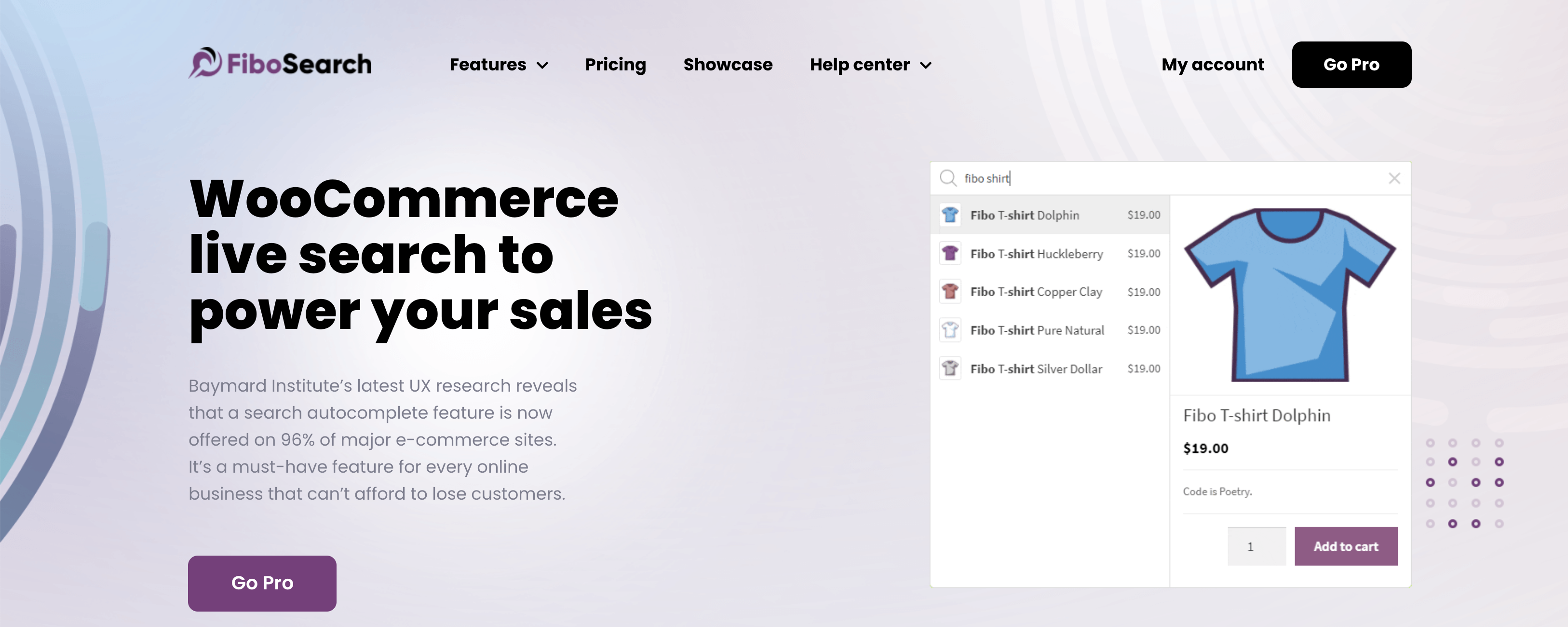
You might want to look into a type of search engine that offers instant search suggestions so users can find the solution before they finish typing. For example, FiboSearch is a good option for an online magazine or blog.

When you are designing your website, you should consider the placement of the search bar. You want to place your search bar in a location that users would expect to find it. Most people expect to find their search bar in the top-right or top-center of the page, as is the case with sites like Amazon or YouTube.
One way to personalize your site is by customizing the search bar. With the Total theme, there are over ten header styles which give you a variety of design options. What’s more, you have the option of selecting what kind of search bar would suit your site best: a dropdown or a fullscreen overlay.
Conclusion
Your customers should be able to find what they want quickly and easily. You must make their journey as seamless as possible. Although visitors may not know how much time or effort goes into creating the perfect site, they will surely notice if there are any navigation issues.
When customers have a seamless experience on your website, they’ll be more likely to complete their purchase and convert. WordPress website tips, such as optimizing the navigation and backing up your site, will help streamline your site for an improved user experience.

Nadejda Milanova
An experienced Content creator in the field of Search Engine Optimization (SEO) and WordPress. A true proffesional with a Master's degree focused on journalism.
Read more by Nadejda Milanova


