


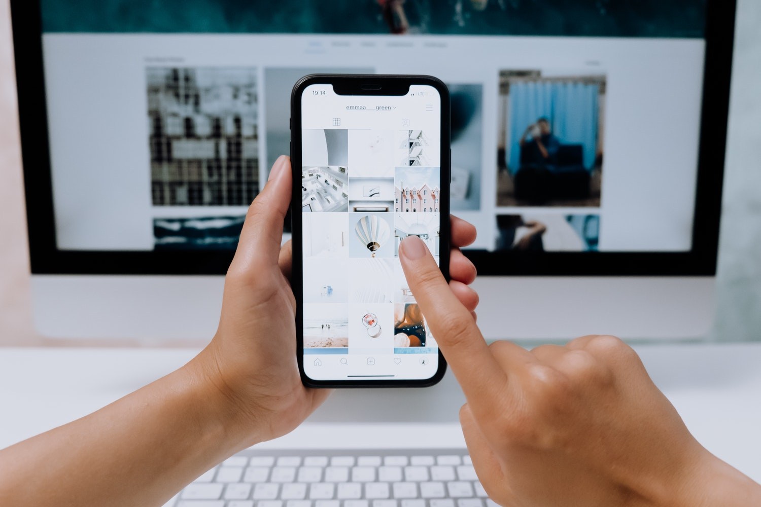
If we had a time machine and could go back in time, it would be very easy to measure humanity's leap in technology. We would clearly see how much the consumption of mobile devices and browsing through the mobile version of the web has increased, which today seems to us the most natural thing that has become part of our daily lives.
And just because more and more people prefer to spend time online on their phones, it's important that websites have an adaptive design suitable for any device. We would even say that a mobile presence is not just recommended, but a must when we want to win over our customers.
According to dozens of web surveys and statistics, as early as 2017, mobile traffic took precedence over desktop traffic. And since Google announced that the transition to the Mobile-First Index for all sites will be mandatory from March 2021, many online business owners have turned their attention to optimizing the mobile version of their sites. This trend is eloquent enough and suggests how important the role of mobile view is for a quality user experience.
So, the focus of this material is all those important points that we need to apply for the optimal view of the mobile version of a website. Let's see who they are and why it's important to keep them in mind.
1. Always use a readable font with a sufficiently enlarged size
Keep in mind that everything looks different when presented on a small device. Therefore, make sure that every text on your site is easy to read and does not make it difficult for the eyes to recognize the letters.
Otherwise, how do you expect visitors to find out where they are and what you present to them? Your idea may really excite them, but it won't be clear if you put "obstacles" in their way at the "entrance".
2. Take advantage of the hamburger menu
If the mobile device has become an extension of your hand and you often spend time on the web, then you have come across sites that use the so-called. burger menu or burger bar. It consists of three dashes arranged one below the other, which discreetly hide the main pages in the navigation. With one click on this button, you can find the information about the site you are looking for.
Domain registration in the mobile version
The burger menu provides convenience when browsing through a mobile device, because all the elements on the site look tidy, without losing their importance. You don't have to make adjustments to the page alignment or rearrange the structure of the home page. When using this type of navigation, you direct visitors' attention to a promotional banner or call-to-action button, for example.
3. Try to keep the user in only one browser window
This way you will not get it out of the main destination - your site. Loading each page in a separate tab is considered a tedious practice and is often a reason to repel visitors. And this is because then they can hardly find their way back to the main page they were looking at.
Such an action turns the user experience into an unpleasant experience that can keep them from returning to the site for a long time. So review all the links and see if they open in new tabs. Use the new tab option only as a last resort.
4. Turn off pop-ups in the mobile version of the site
Have you ever been in a situation where a pop-up window with a promo offer or an important message appears when you open a site, but you can hardly close it? If this has happened to you, then you certainly remember what emotion this provoked in you.
It is quite common to get annoyed by the inability to close this window. And this, in turn, can naturally motivate you to close the site. It's the same with your visitors. When you want to draw their attention to something exclusive that you offer them, do not do it with a pop-up window. Look for another attractive way to show them what is important to see.
In addition, Google "does not look with good eyes" on sites that resort to this method of provocation in their mobile versions. The pages that use this marketing technique are sanctioned by the global search engine by lowering their position in the search rankings.
5. Simplify the forms for filling in / registering on the site
Don't make users enter data indefinitely. There comes a time when after the next field you just lose interest. And what does this lead to? That's right - until you drop out, or leave. Many ways to say that users simply leave our site, refusing to interact with it.
Make a list of the most important information you need. This may be just a name and email address, or you may need a phone number. Save time and extra effort on the audience. She will appreciate it and keep her kind attitude towards you.
Filling form
Add only the fields for the most important information - name, email address, phone number.
6. Links and buttons
This gravitates through design circles and connects with nearby elements that are difficult to click on. In most cases, either the buttons are too small and inconvenient to interact with, or the links on the page are completely pushed together and again there is a prerequisite for leaving the site.
The user cannot perform the desired action and spins in a vicious circle until he gives up. That is why it is important to highlight the buttons and links. Allow visitors to move freely from one page to another and take care of their pleasant stay on your site. Because the experience is remembered long after.
7. Save space with folding sections / accordions
Accordions are an indispensable helper in building a mobile version of the site. They are an elegant and practical solution in cases where the volume of content makes it difficult to absorb information. With their help you solve the problem of difficult orientation and at the same time arrange the text, making it easy and convenient to read on a mobile device.
Accordion in mobile version
This is what the accordion looks like on the site via a mobile device.
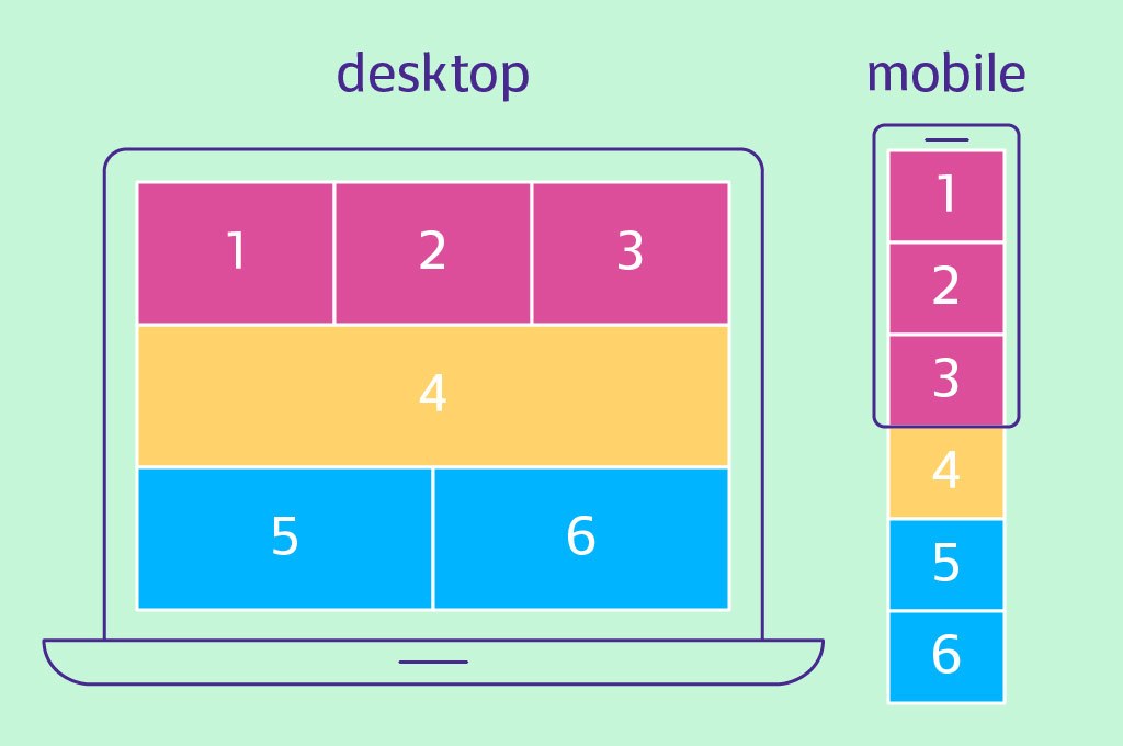
8. Maintain synchronization between desktop design and mobile device
According to an unwritten rule that has become the law for web designers, always the most important information on the site is at the top of the page. Starting with the logo, through the navigation, and ending with the opening banner with the message.
And if the desktop version has the potential to place these elements at a sufficient distance from each other, then the mobile version does not have as much space. However, the hierarchy follows the same ordering logic as the desktop version. Always the most important components are located at the top of the mobile view.
When optimizing the mobile version of your site, make sure you rank the parts of the page in descending order of importance - from highest to lowest. This will synchronize the view of the different devices.
Hierarchy of important elements in the site for different devices.
9. Pay attention to the images
Slow loading of photos on the site could have a negative impact on the user experience. If the images don't clear up within a few seconds, it's uncertain how long visitors will stay on your page. Because no one likes to wait.
That's why you need to optimize them. Even more for a mobile device.
10. Make the contacts on your site clickable
Do you remember what is the biggest advantage of a mobile device? Above all you can make phone calls through it. So what stops you from reconciling this benefit with the benefits of the site?
Once you've left your phone number on the contact page, make it easy for your customers to contact you. You just need to link all the links such as number, social networks, and address. Show visitors that you are open to talking to them and make it as easy as possible for them by shortening the steps that separate them from communicating directly with you. Shorten the distance with one simple action.
And finally…
Always put yourself in the shoes of your customers and visitors. As the saying goes, try to look at your business through their eyes. This way you will make the right decisions about building a convenient mobile version of your site.
And remember that for everything you want to do as an improvement on your site and its appearance for different devices, you can contact us by chat, email, and phone. We will be happy to answer your questions.

Nadejda Milanova
An experienced Content creator in the field of Search Engine Optimization (SEO) and WordPress. A true proffesional with a Master's degree focused on journalism.
Read more by Nadejda Milanova

